Overview
Microsoft Teams is a business communication platform created by Microsoft. It's part of the Microsoft 365 suite of products. It provides features like chat, video calls, files storage, and connection with other applications.
One day, I discovered that my friend was using Microsoft Teams, while I use Slack daily and had no prior knowledge of Microsoft Teams. My friend likes the software but occasionally gets frustrated while using it. This sparked my curiosity, and I decided to write a case study to explore the differences between the two platforms.
Role
Research
UX Design
Tools
Figma
Draw.io
Excel
Problems
I began researching Microsoft Teams and discovered that it is a powerful tool often utilized by large companies and those who frequently use Microsoft tools. However, I encountered some issues with the software. Many people mention that some features and options are not intuitive or easy to use. Additionally, the product lacks proper notifications.
Goal
Companies often hesitate to update the UI or user-flow unless it's a critical issue because doing so requires the involvement of multiple teams and can be costly. Additionally, it can be more complex than it initially seems. As a UX designer, it's essential not only to identify problems but also to gain a better understanding of how the UI code is constructed. In many cases, UI components use internal or enterprise libraries. While using libraries expedites product development, it may have downsides - UI lacks intuitiveness, making adjustments challenging. Therefore, it's crucial to collaborate with engineers, understand how UI components are built, and assess the feasibility of cost versus gain, of implementing new features.
In this case study, I will focus on minor improvements that can reduce user confusion and enhance their experience when using Microsoft Teams product.
Research index
-
Product research
- What is the company selling? Understanding the core offerings and products/services of the company.
- Who is their target audience? Identifying the specific demographic or customer groups the company aims to reach.
- Platform usage: Check which platforms the users mainly use for the product.
-
Detecting users' pain points
- Interview people who use the product daily.
- Find real comments on the internet to identify crucial pain points for users.
-
Conduct a comparative analysis
- Research what other companies do and create a SWOT analysis.
-
Design research
- Downloaded 7 different chat apps and 5 different types of chat platforms for the purpose of studying their user interfaces.
- Check out Android templates and restrictions (for example, material, Canva, Uizard)
-
Test the product
- Use the product and try to understand the pain points. (Currently, my company works closely with Microsoft, so I have access to their applications.)
- Use the friend's account to test it.
Product research
Over
1M
Microsoft Teams has become a crucial tool for remote work, and here are some statistics that highlight its usage and impact:
- Over 1 million companies are using Microsoft Teams.
- Microsoft Teams' video calls have increased by 1000% since the pandemic.
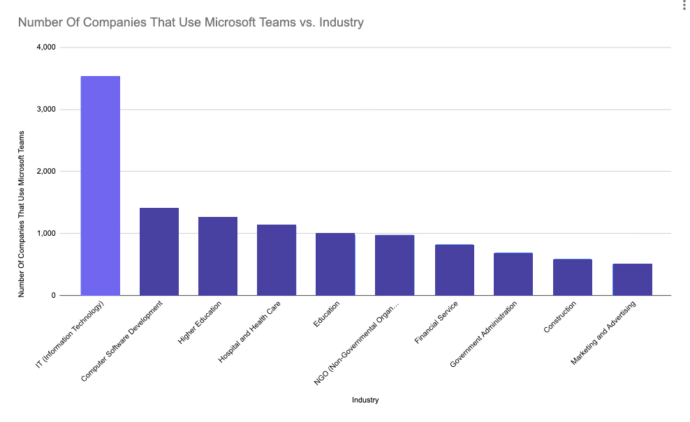
Microsoft Teams is used the most in the Information Technology industry. 3540 Information Technology Companies are using Microsoft Teams.
Users statistics
Analyzed Microsoft Teams statistics (Users, Trends & Data) to understand who the main target audience is and how the product has grown in the market.
Also, you need to determine what platform most users are using (PC, iOS, Android) to access the product.
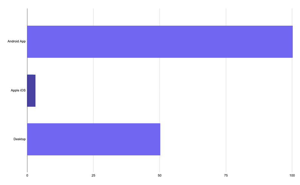
User download count
Over 100 million Microsoft Teams apps were downloaded on Android.
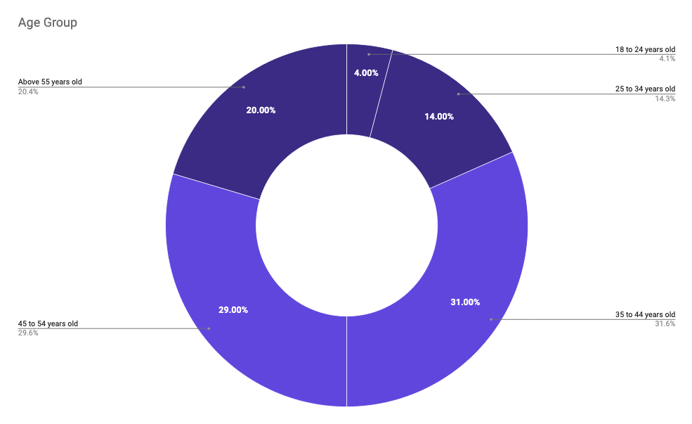
Users age
- 60% of users are above 35 years old.
- 72% of men and 24% of women are users of Microsoft Teams.
Detecting User Pain Points
In the game industry, predicting user behavior can be challenging, even after conducting numerous playtests. Internet user reviews often play a vital role in product improvement, providing genuine insights from daily users. After launching games, I read online comments to understand user's pain points and gather valuable feedback
🤕
In this case study, I use my method to examine real user feedback online. Many users have mentioned that the software is difficult to learn, some features lack intuitiveness, notifications are lacking, and there are bugs.
Competitors research
Competitor Research: Microsoft Teams primarily competes with Slack, but I've expanded the comparison to include other major companies such as Google, Zoom, Discord, etc., to assess their target audience, goals, strengths, and unique qualities.
| Company | Target | Strength | Weaknesses |
|---|---|---|---|
| MS Teams |
|
|
|
| Slack |
|
|
|
| Google Chat |
|
|
|
| Discord |
|
|
|
Design research
Since most users use Android, I'll begin with suggestions for Android first.
-
I am an iPhone user, so I decided to study Material Design
a bit.
- I downloaded one of the popular Material Design kits from the Figma community.
- I read the Material Design Guide.
- To assess how the interfaces are interactive, I borrowed my partner's phone and opened various types of apps.
- I downloaded seven different chat apps for the purpose of studying their user interfaces.
Product test
At my current company, we work closely with Microsoft, and some parts of our work involve using Microsoft applications. So, I downloaded the web application to conduct tests.
However, my version lacked real data, so I borrowed my friend's computer to test specific aspects with real communications.
After collecting this information, I dedicated time to conduct a comprehensive product test and understand the pain points mentioned by users.
Solutions
In this Case Study, I won't cover everything I found, so I'll focus on one scenario and provide a solution for it. I've chosen to address a common concern that many people have raised: notifications. I've identified areas where notifications are needed upon completing actions.
Additionally, some users complained about excessive updates, so I brainstormed ways to make minor changes with a significant impact.
I decided to re-evaluate the process of creating new team channels, as this is where teams communicate and share messages, tools, and files.
Since the majority of users use Android and desktop, I conducted testing on these two platforms for the redesign
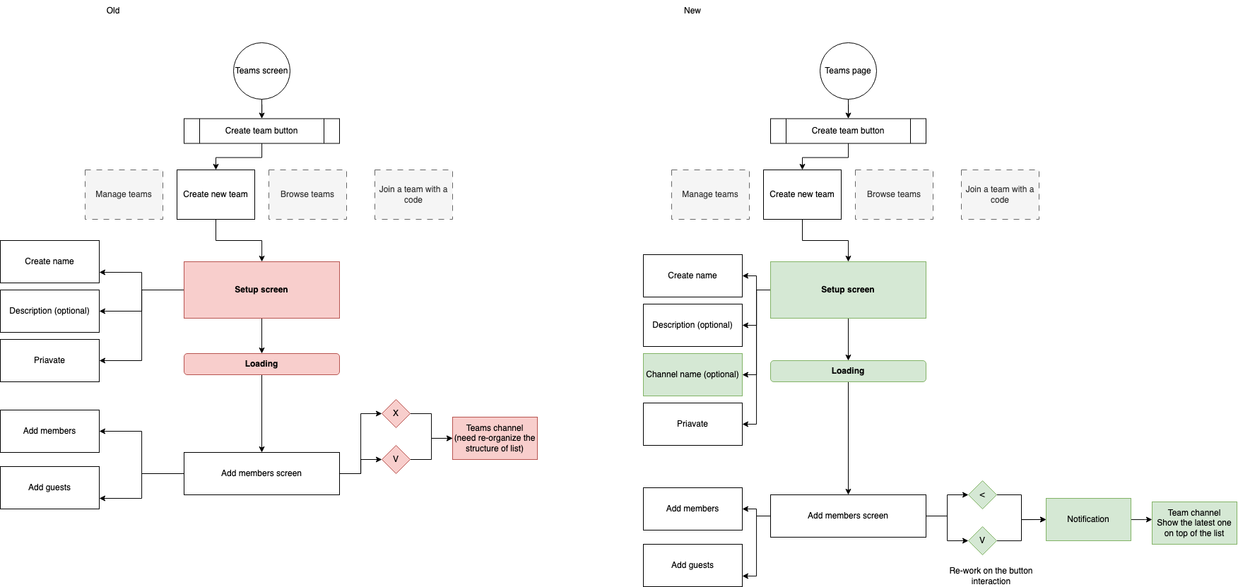
Create new team flow - Android
Problems
- The loading screen appears randomly and disappears too quickly.
- The buttons on the 'Add Members' screen lack clarity.
- Notifications are not functioning.
- No alert or notification after a user creates a new team.
Solutions
- Ensure the loading screen remains until the transition to the next screen is complete.
- Update the buttons on the 'Add Members' screen.
- Add a notification or interaction after a team is created.
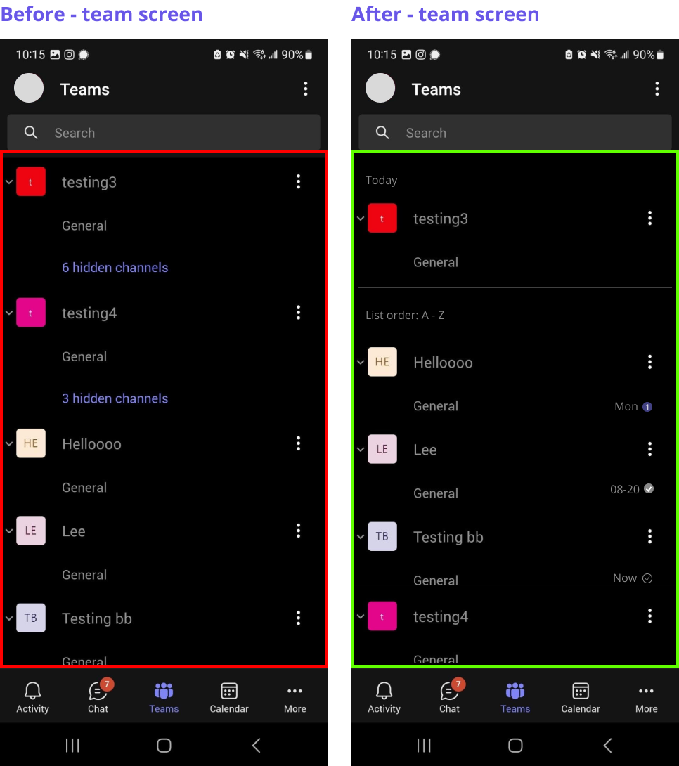
- After a user creates a team, display the newest team at the top of the list, making it easier for users to find new teams (or open the General Channel of the newest team).
- Provide information about the general channel while people are creating a team.
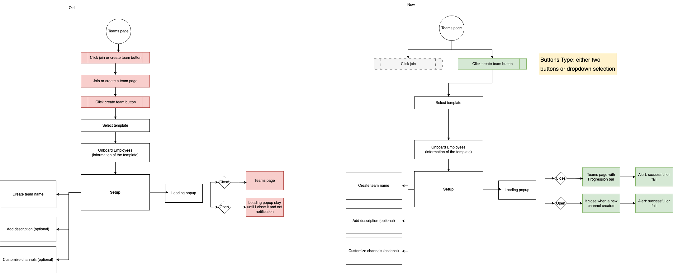
Create new team flow - Desktop
Problems
- There are too many unnecessary steps.
- The user interface (UI) lacks clarity.
- There are no notifications after actions are completed.
Solutions
- Separate the buttons for 'Join' and 'Create New.' You can do this either through a dropdown button or by creating two separate buttons.
- Provide a clear UI. Ensure that users don't have to guess what it is.
- Provide clear notifications during ongoing and completed processes.
- Ensure that users don't have to guess what has happened.
Problem solved - layout
I aimed to create a simple and clean user interface, with a primary focus on ensuring the transition process is intuitive and delivering a user-friendly experience.
Because Android is the platform that most users use, I chose to modify the Android layout first.
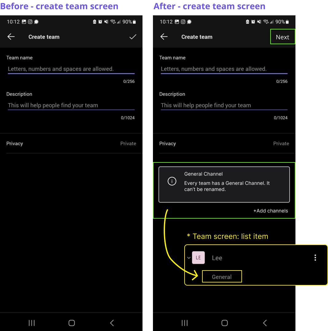
Add information
Include information about the general channel so that users can easily identify it on the team list screen. I noticed this information is displayed on the web version but not on the phone.
Button consistency
In the next page, I will replace the icons with text to make it clearer. Therefore, these icons need to be updated as well.
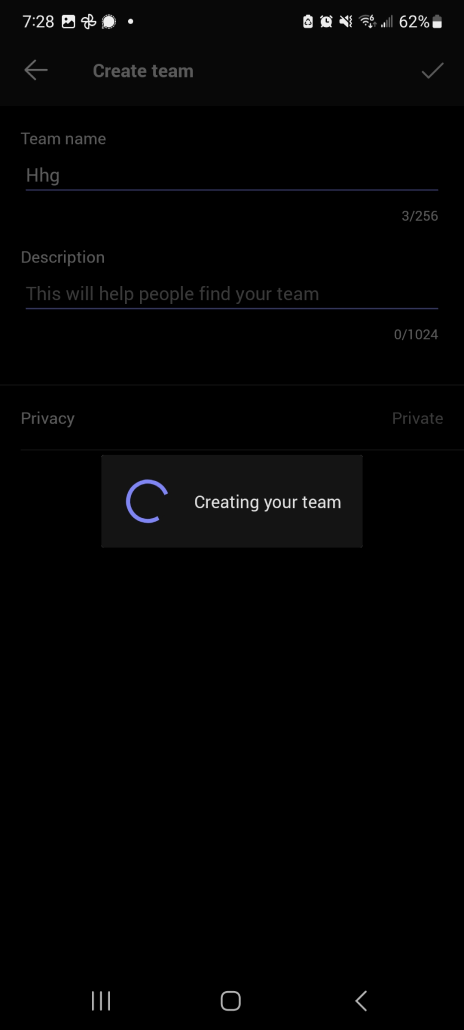
Bug: Loading Screen
The loading screen doesn't stay visible long enough; it disappears after just one or two seconds, sometimes not showing at all. It should remain visible until the next screen fully transitions.
Update Icons for Clarity
- X-Button: When I first saw the 'X' icon, my initial impression was that it would prevent me from creating a team and discard the process, but it actually generates the team. The icon lacks clarity, so I recommend redesigning it for better user understanding.
- Replace X Button with Back Button: Considering that the app is used for business purposes, providing users with a second chance to edit or review the team's name before creation might be beneficial. However, if the design intent is to prevent users from navigating to the previous screen, it may be better to remove the button altogether.
- Icon vs Text: The checkmark icon is not entirely clear; it can be interpreted as adding a friend. Since users can add as many members as they want, replacing the icon with text would enhance clarity. In my observation of the seven different chat apps I downloaded, they all use text for this purpose.
Notification
- After creating a team, it's important to inform the user that the process is complete, rather than simply returning them to the main screen. There are two possible solutions to address this issue:
- Case 1: Automatically open the general channel that the users have just created, allowing them to begin interacting immediately.
- Case 2: Provide some form of visual interaction or notification, such as displaying the latest team at the top of the list, making it easier for users to find and access their newly created team.
- If the order of the list functions differently from other chat apps, it's advisable to clarify how the list is organized to ensure user understanding. (ex. List order: A-Z)
Learnings
It was enjoyable to research the product that I use daily and the competitor's apps. Even though the concept is the same, the methods vary significantly, and some are quite unique. In the future, I would like to run user tests to gather real feedback from users.
Additionally, it was fun to invest time in learning a bit about Material design and apps.