Overview
The client, Paysherped, is a B2B platform company that centralizes, digitizes, and verifies all cost submissions related to labor, equipment, and materials. It's designed to proactively alert to potential risks.
Paysherped is in need of a fresh design that prioritizes user-centrality. I joined the team to address usability issues and ensure that users can easily access all the data they require for their work, effortlessly organize table layouts, and manage submissions.
In this project, I worked closely with both front-end and back-end developers to rebuild crucial pages of the site.
Role
Product Design Lead
Duration
1 month (part-time)
Client
Challenge
While developing the design for the B2B platform, my primary challenge was to align with and fully understand the brand's unique tone of voice. My goal was to implement an updated UI/UX that seamlessly aligned with the client's requirements and vision. Additionally, I carefully considered how to effectively present large volumes of data to the user.
Research & Planning
-
Deep understanding of the company and its project:
- Identify the target audience, what they aim to sell, and the overall direction of the company's goals.
- Determine the critical factors for business success.
-
Find problems:
- Engage with clients to uncover the primary issues they face with their clients.
- Conduct online research to discover common pain points users have with B2B platforms.
- Create an account on the platform and conduct usability tests.
-
Design research:
- Research other platforms to understand how they effectively present chunks of data on their pages.
- Stay updated on current design trends by exploring the latest design trends on the internet.
Problems
In the beginning, the client wanted to create a prototype to demonstrate the platform's functionality to their clients. Their primary focus was on this aspect rather than the user experience. However, after securing some clients and people began using the platform, some clients expressed concerns about the user interface. As a result, they have decided to prioritize making the site more user-friendly and have requested my assistance.
What are the issues or concerns that people have with the client's platform?
Some clients require certain information, while others do not.
There is no filtering functionality, so people have a hard time finding information.
Not enough notifications.
Unnecessary clicking.
Research the user engagement of the sites that the company is benchmarking.
Complicated to setup and learn.
Time-consuming to maintain.
Sometimes fields/criteria can be limiting and extremely confusing.
User interface must be definitely improved.
Proposed Solutions
-
Efficiency in Rebuilding the Website:
- As the company is small and I work part-time as a freelancer, I implemented an 8pt design system and used rem units for typography. This helps developers address minor issues even when I'm not available.
- Utilize the Bootstrap CSS library to unify layout and design elements.
-
Enhanced Functionality:
- Introduce a filtering system to allow users to quickly find information.
- Make the menu user-manageable, enabling users to remove tabs they don't need and reducing unnecessary scrolling.
-
Update Design:
- Revise and enhance the design layout and composition.
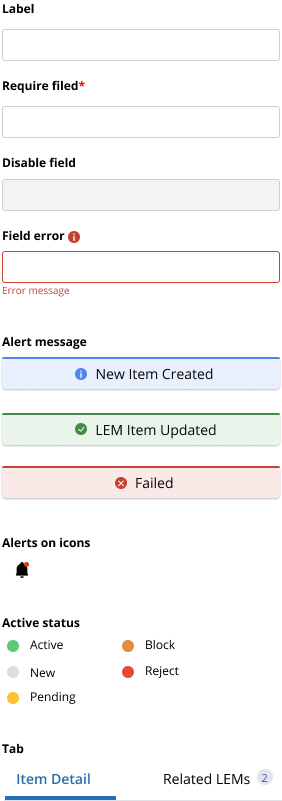
- Add clear notifications to prevent user confusion about system statuses.
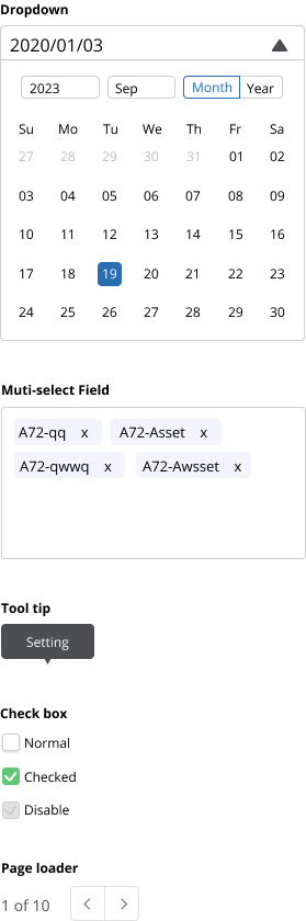
- Create new icons with simple symbols and add tooltips.
- Ensure that data and content are correctly categorized, and reorganize if needed.
- Prioritize a user-centric and intuitive design.
-
Simplifying the Process:
- Consider following the 3-click rule as it can help users achieve their goals before becoming discouraged. While it may not always be the perfect approach, it's worth considering.
Design System
There were no design systems or UI components, so I encountered a new design system.
Grid
Use 8 point Layout Grid Systems. Because consistent and scalable spacing helps both designer and developer to work much faster on a project.
Typeface
Mainly use Open Sans for typography and apply a type scale for text sizes, except for the body font.
Title
31.25px
1.953rem
SubTitle - H5
20px
1.25rem
Body - p
16px
1rem
Body small - p
14px
Small - p
12px
0.8rem
Color
Client wanted to retain their brand colors, so I modified just a little bit to make it work with new design.
Old colors
New colors

Icons
I've noticed that in many cases where users are confused between content icons and the icons in the top menu. To distinguish between the two, I've implemented different styles.
Top Menu Area Icons
Content Area Icons
Interface
I recommend using Bootstrap CSS framework to quickly style the UI elements, while also providing a UI guide for the developers.
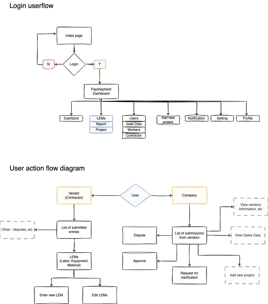
Information Architect
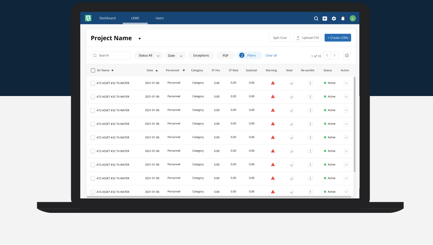
I reorganized the menu groups. Initially, there were 10 different types of menus displayed on the pages. Some pages contained very similar information. I reorganized the groups and categorized the pages accordingly. My primary focus was on the LEMs section, which is crucial for the business.
Some companies run multiple projects simultaneously. Therefore, I reorganized the pages and merged the submission page with the vendor submission page. Both vendors and companies will view the same table to align costs and timelines. However, they need to input different information. As a result, users will see different types of buttons on the screen depending on their status.
Problem solved - layout
I aimed to create a simple and clean user interface, with a primary focus on ensuring the transition process is intuitive and delivering a user-friendly experience.
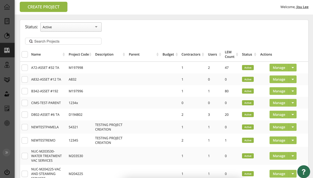
Before - The cost submissions page
- Users need to switch between tabs to view the details.
- Not enough filtering where user can filter data
- Insufficient information for some clients.
- Excessive scrolling without clear indications.
After - The cost submission page
- Group the pages by the project name.
- Add filtering to allow users to quickly retrieve information.
- Add a menu settings button where users can customize their menu.
- Include page numbers at the top for easy navigation to the next page.
Before - Vendor submission page
Placing all the data into a small table makes the information cramped and hard to read. Users need to switch to different tabs to change the approval status.
- The users have to scroll horizontally and vertically to see useful information.
- Additionally, category sections are divided into accordion-style sections. To view information from another category, users must close one tab and open another.
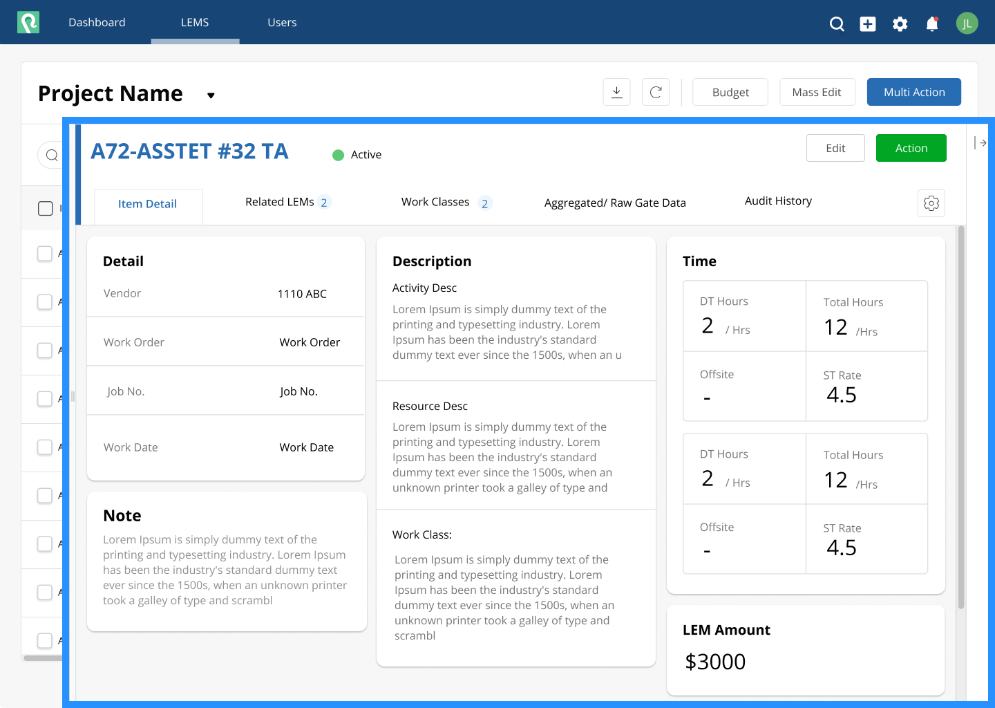
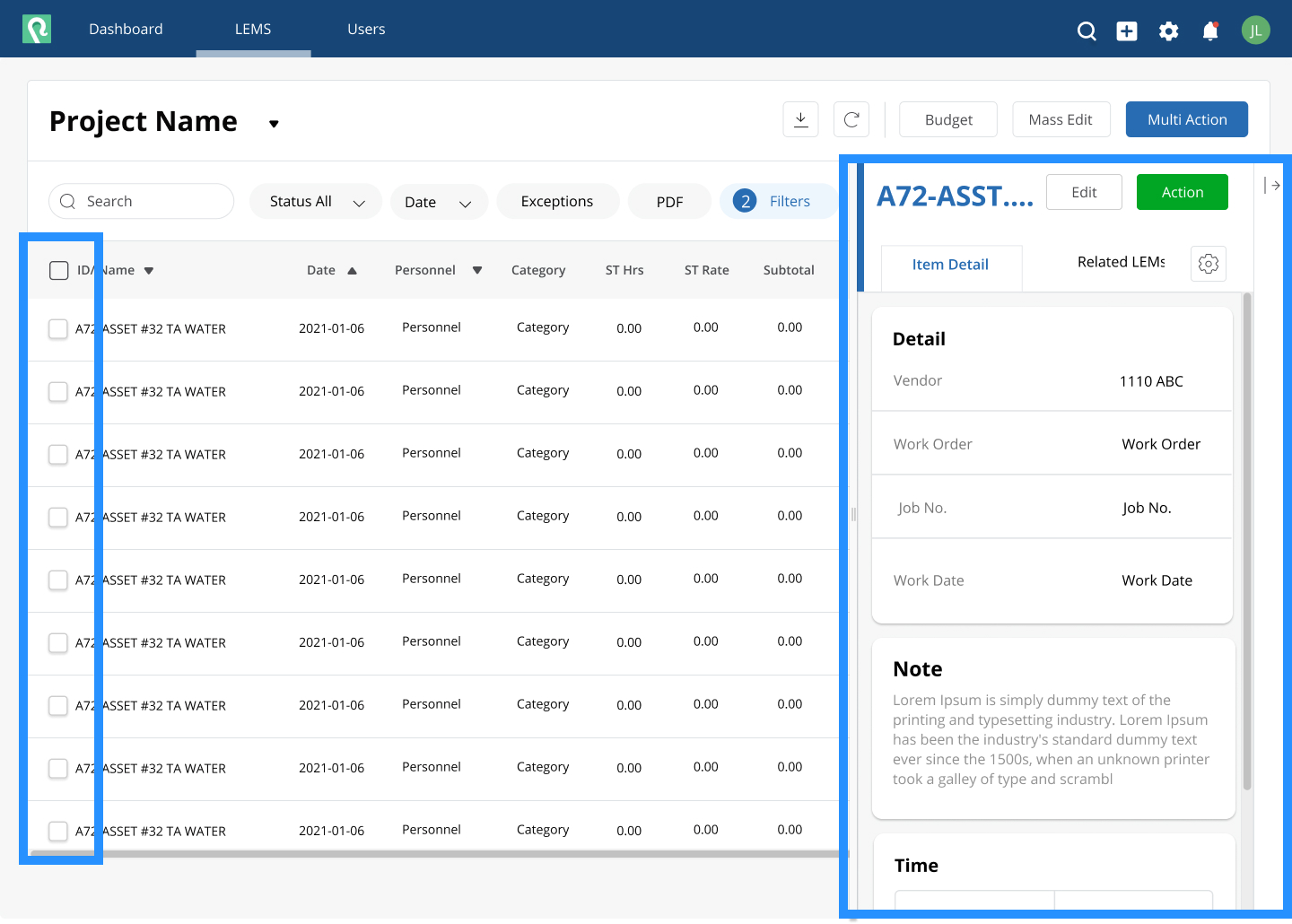
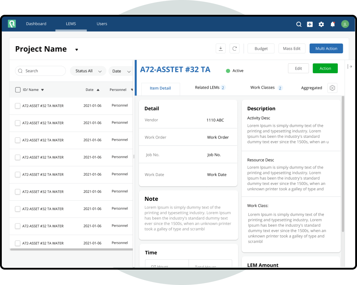
After - Vendor submission page
Users will view the vendors submission information after clicking on an individual item from the list. A company needs to approve or dispute this information.
- Allow users to reduce the size of the detail page by using a scalable bar so that they can click the checkboxes while viewing the details.
- After users select all the item they want to approve or dispute, they can click the 'Multi-action' button to perform actions on multiple items at once.
- Instead of using a table format to display the data, use a card-style layout to present the information in a more flexible manner. I also take into consideration users who will access the information on small screens; they can still view all the information by scrolling vertically.
- Allow users to manage the menu and choose the information they want to see.
- Organize the categories with tabs so users don't have to scroll down to access information from different categories.
Figma Prototype
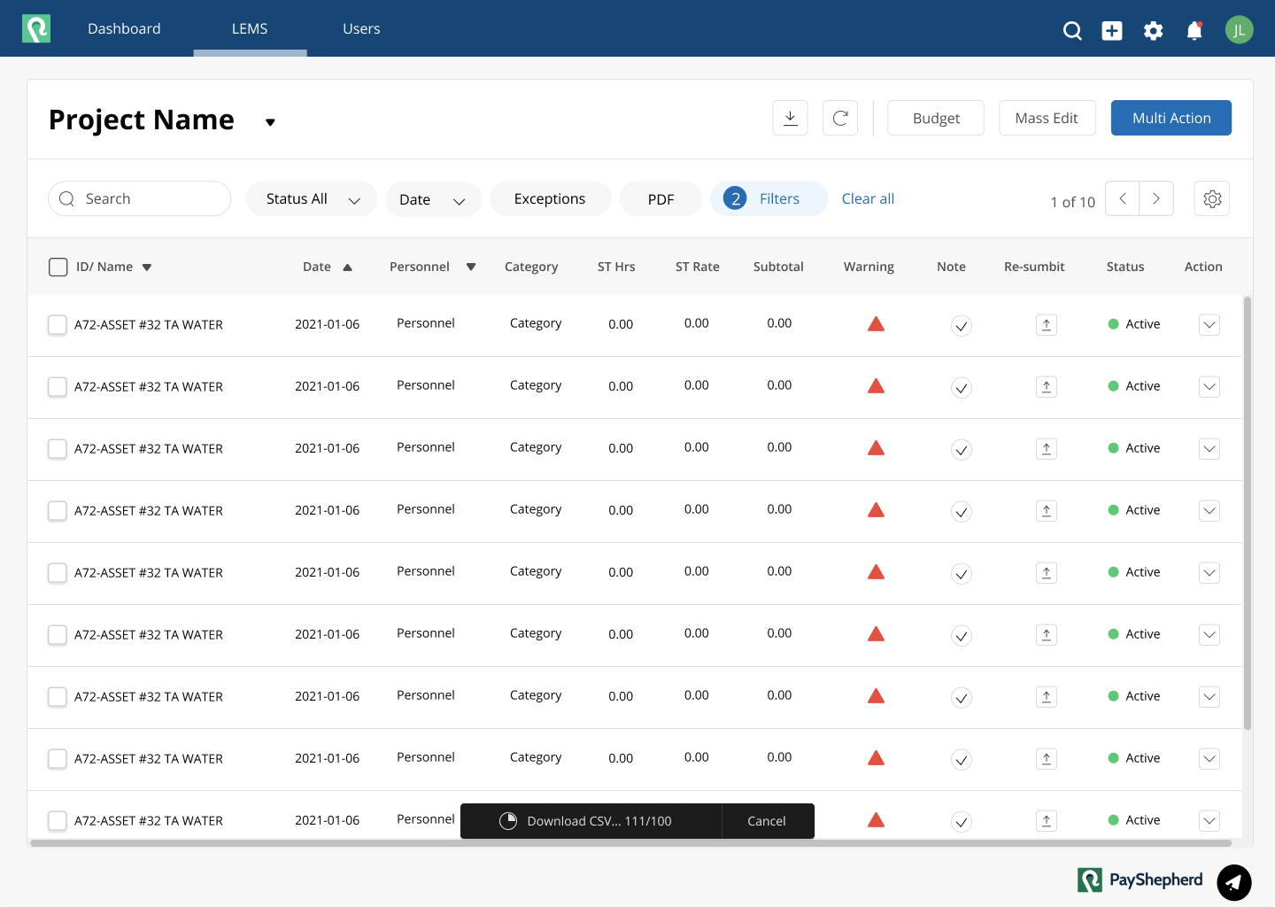
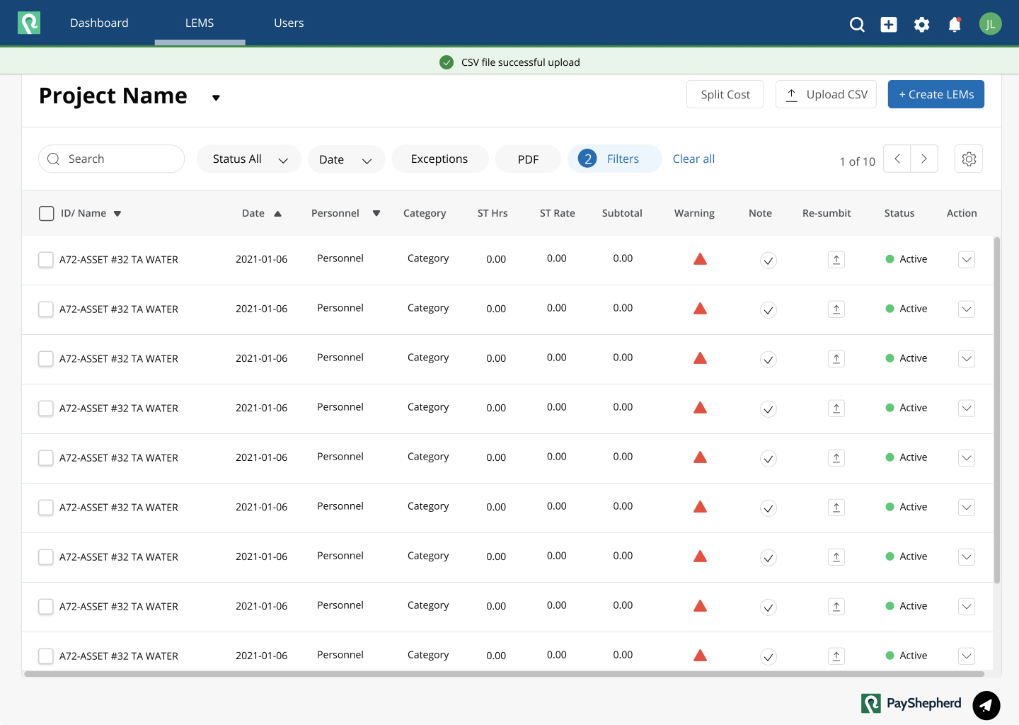
Add notification
Previously, there was no clear notification provided to the user after they performed an action. To address this, I introduced a clear notification flow into the site guide.
- Include Loading Progress Bar
- Include Alert System: After downloading progress is completed, it triggers an alert confirming that the file has been uploaded successfully.
Usability Test
Since I was freelancing, I couldn't conduct real usability tests with actual users. However, I conducted in-house usability tests by having colleagues and team members try out the paper prototype and Figma prototype. Additionally, I asked some friends to test it.
Learnings
I enjoy tackling new problems and providing solutions. This project was a challenging journey, but it offered an opportunity to explore different industries. As a UX designer, collaborating with professionals from other fields was a valuable and enriching experience.
What Can Be Improved?
While freelancing to assist the client in resolving critical site issues, I didn't have the opportunity to assess user engagement. However, if I were working full-time, I would regularly monitor analytic tools and data to identify user pain points. I would also conduct user surveys to enhance the site. While these are solutions for the current challenges faced by the client, I believe that future improvements will depend on market trends, technological advancements, and user behavior. Therefore, I will continue to adapt to new technology and design trends to improve the site.