Project Introduction
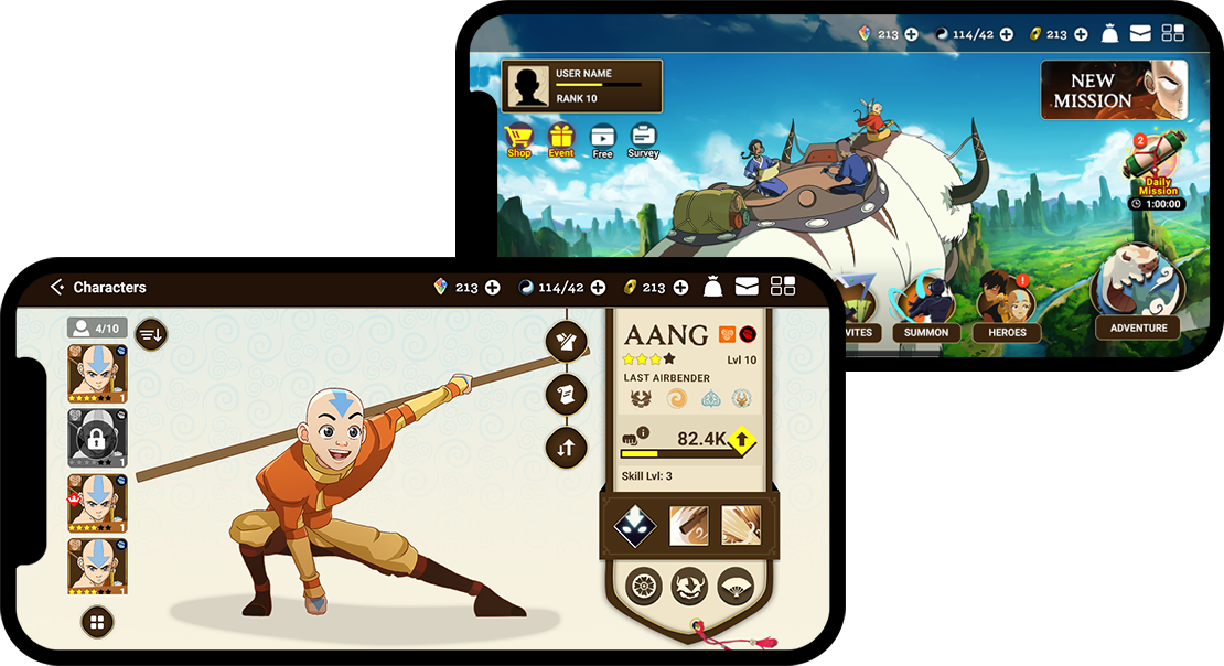
The Avatar: The Last Airbender mobile game was released in 2023 for both iOS and Android platforms and was built using Unity. I have been part of the team since the project's inception, contributing to the creation of the design proposal deck for Square Enix, the investor. As a UI/UX designer, I played a key role in managing complex UX flows that involved multiple teams. I closely collaborated with other designers to enhance the game's overall quality.
Role
UX/ UI Design
Tools
Photoshop
XD/ Invision
Figma
Engine
Unity
Perforce
Getting started
At the outset of the project, our team was small (later expanding to collaborate with two different designers). During this phase, I worked closely with our game director, who possesses a deep passion for crafting exceptional gaming experiences. As an indie game company, it was crucial for us to create a compelling presentation deck to pitch our idea to potential clients.
Our game director conducted extensive market research to identify pain points and unique features within the RPG market. I actively assisted in creating user personas and finalizing the presentation deck.
Our overarching goal was to develop a captivating mobile game that players could enjoy seamlessly, without any frustrations or barriers. Our key performance indicator (KPI) was a monthly revenue target of over $1 million.
Research
-
Understanding game genre:
My initial step involved gaining a comprehensive understanding of the game genre and assembling all the essential resources. I downloaded all the competitors games and started playing.
Additionally, I sought guidance from our game director, who recommended specific benchmark games for reference. Notably, one of the recommended games achieved remarkable success, generating $1.5 billion in revenue and maintaining strong performance over time.
-
Design research:
I consistently search for UI element references. My preferred sources include Google, Interface In Game, Game UI Database, EA Accessibility, Pinterest, Dribbble, and Behance. Additionally, I regularly watch GDC (the Game Developers Conference) to stay updated on game industry knowledge and the latest trends.
-
Learn about unity engine:
I firmly believe that it's crucial for a designer to have a deep understanding of how UI is implemented in the engine. Consequently, I dedicated significant effort to thoroughly comprehend the inner workings of the game engine.
-
Study of target users:
Since the cartoon is old and popular, most of the users are big fans of the Avatar series. To connect with them, I watched the entire cartoon series to gain a deeper understanding of the story behind it.
Challenges
Nickelodeon (the IP owner) didn't want the game to resemble the cartoon. So, as a UI/UX designer, I conducted extensive research and testing to create a fresh design that our players would appreciate. I developed detailed plans and paper prototypes to showcase our ideas to our partners, including Nickelodeon and Square Enix. Square Enix really liked my paper prototype, and we engaged in a long and productive discussion.
Another challenge - the version of Unity we were using didn't support responsive design. As a result, I had to adapt everything to fit into a 4:3 ratio, which proved to be a quite challenging task.
Design Ideas
Key Words
UI Elements
Grid
The game supports iOS and Android, with the largest platform screen ratio being 4:3 (tablet). It's important to ensure that the design fits within this 4:3 ratio, and we can use anchor points to make elements expand appropriately across different platforms.
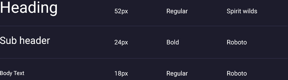
Typeface
Consider using a limited number of font styles. For headers, utilize the Avatar style font, while for body text, opt for a more standard font to ensure readability.
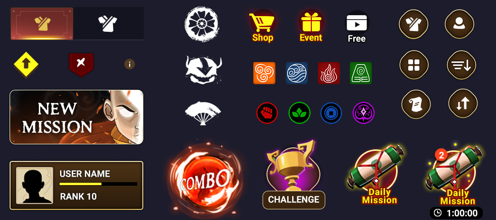
Icons
Design universal icons for use in the game, keeping them as simple as possible since they'll be placed within the app. Conduct in-house user testing to determine their optimal appearance. Additionally, consider adding tooltips to the icons to assist users
In game UI elements
The art from art team and I applied the texts and UI elements around it.
Accessibility: For Color Blinder
When I designed the icons, I attempted to differentiate them using colors while also providing distinct icons. This way, people who cannot distinguish colors can still understand the icons with the help of tooltips.
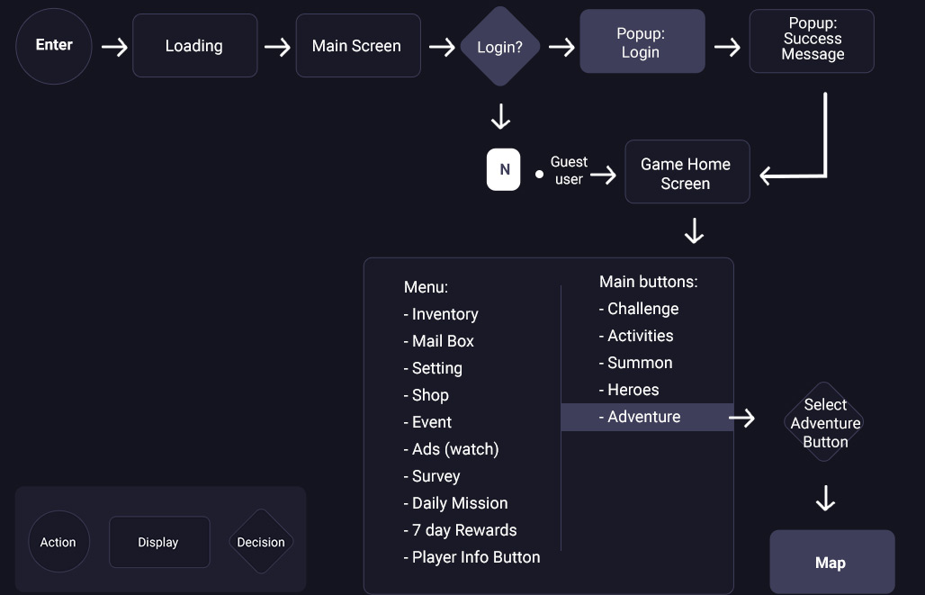
Information Architecture
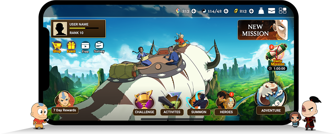
I prefer to break down the information architecture map when I work with a team, so that we can align with the plan effectively. Breaking it into smaller pieces is essential because sometimes it's challenging to communicate with the team when dealing with large maps. Here is a basic user flow that explains how a player enters the game and reaches the lobby screen.
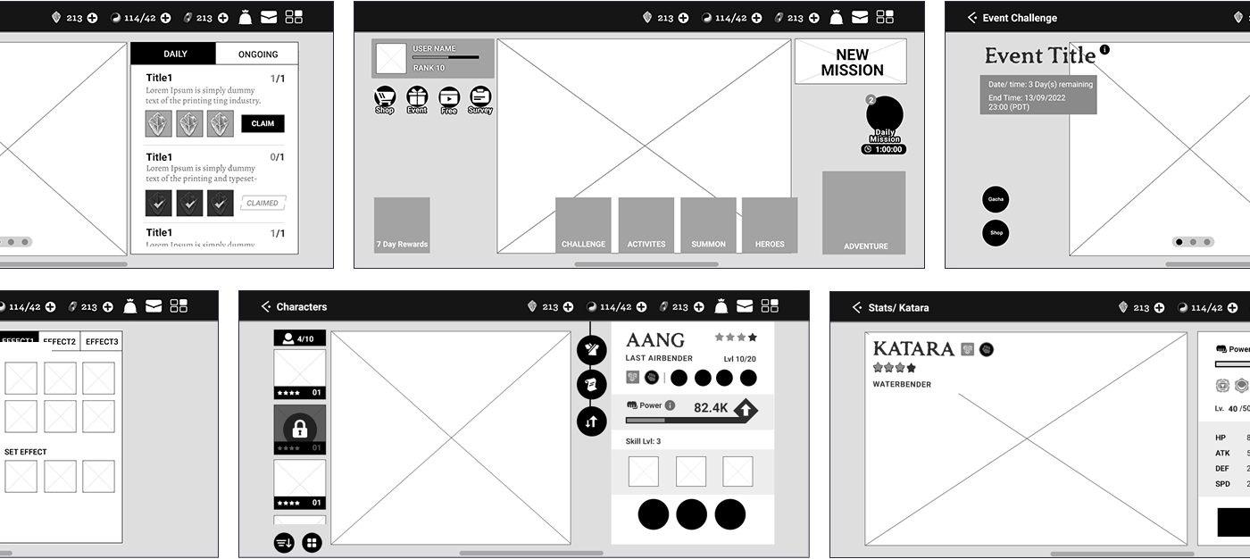
Wireframe
Designed low-fidelity wireframes for the complex user flow
Breakdown Components
As a UX designer, my primary responsibility is to provide comprehensive guidelines for both the engineering and art teams, ensuring alignment with all involved teams.
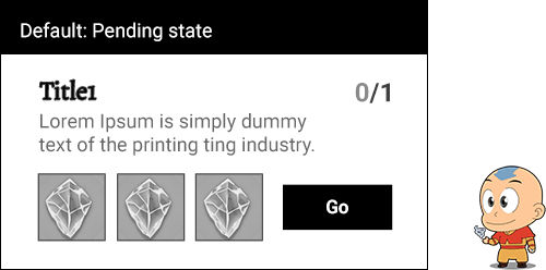
List Item State
Provide guidelines for changing the status of list items after the user clears a mission.
Anchoring Info
Due to technical restrictions, I began creating mockups with a 4:3 ratio. These anchoring mockups demonstrate how the layout will expand as the screen size increases. It's important to note that our current game engine doesn't support responsive design. The width stretches based on the anchoring points, while the height remains fixed.
Visual Sample
In-House Usability Test
Once the mockup is reviewed by the game director and engineers, I conduct in-house usability tests using an XD and Invision prototype. Additionally, we share it with clients to provide them with more clarity about our plans. (We consistently receive positive feedback, and they are impressed, especially since they have never seen an active version of the paper prototype.) After collecting feedback from co-workers, I continually think about how to make the game better.
Design Solutions
While I was working with different designers, I provided solutions when they struggled to finish the design layout.
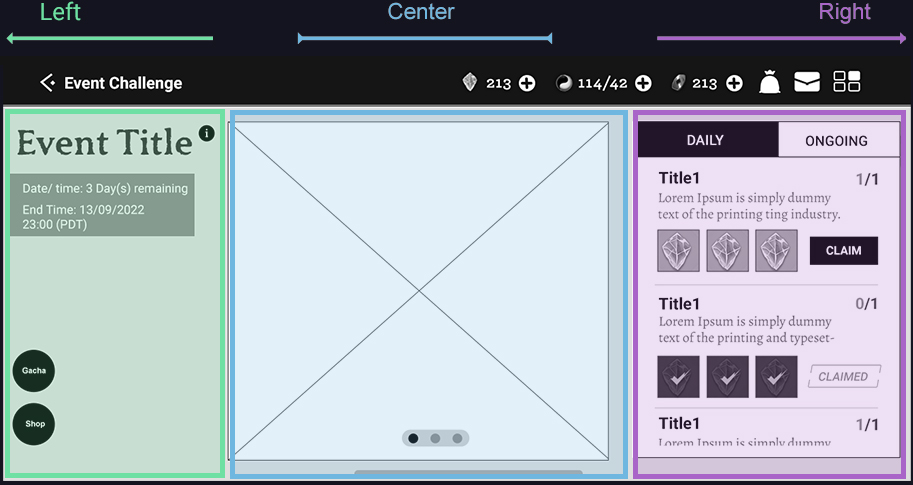
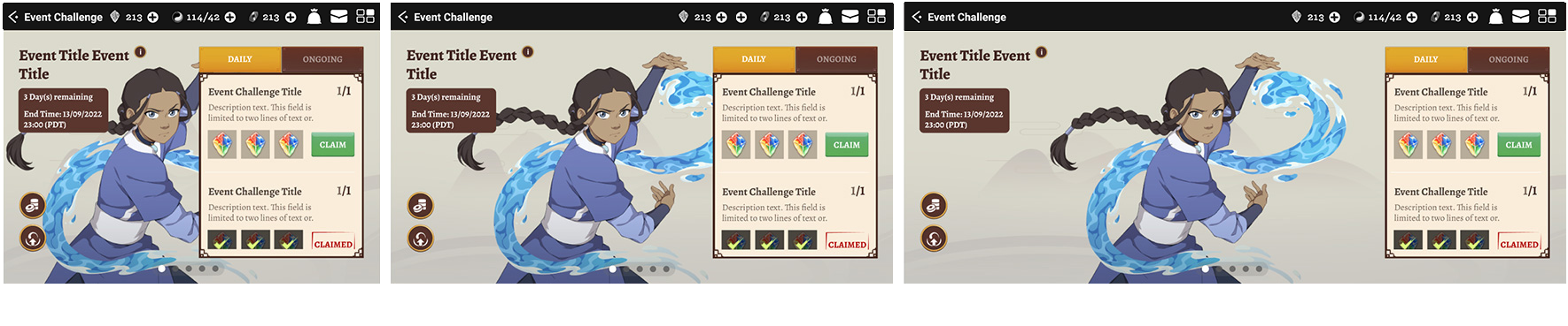
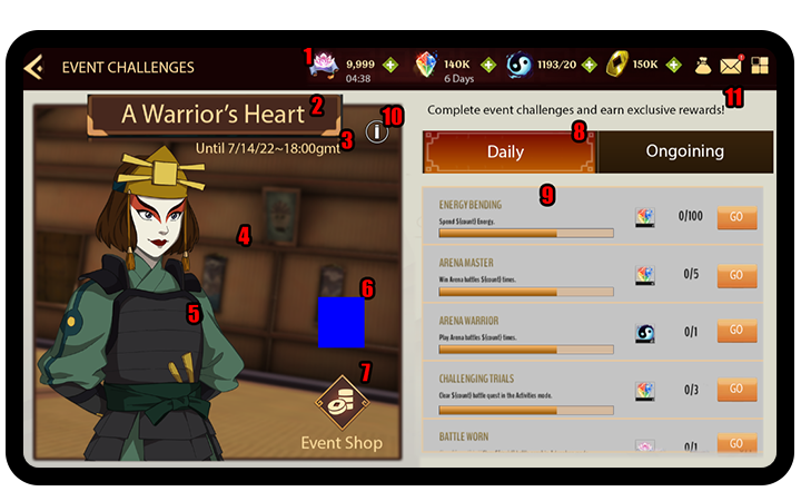
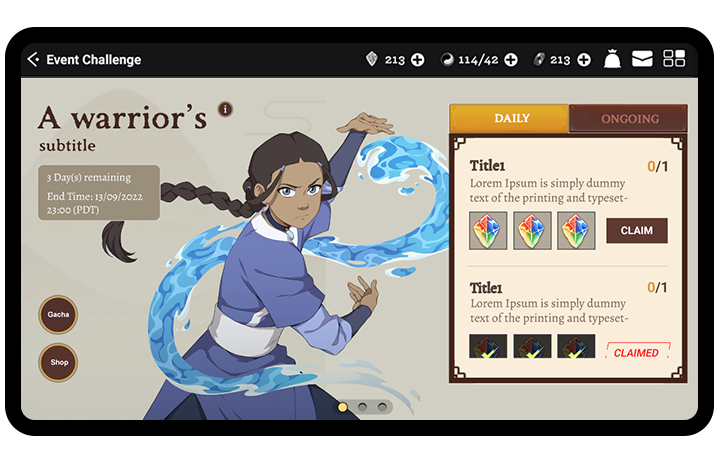
Event Challenge Screen
Remove unimportant text or hide certain information behind the info button. Allow users to concentrate on the events listed. The Gacha and Shop buttons are crucial for sales, so I needed to identify a location that is both prominent yet not overwhelming or conflicting with other elements.
Before
After
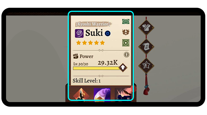
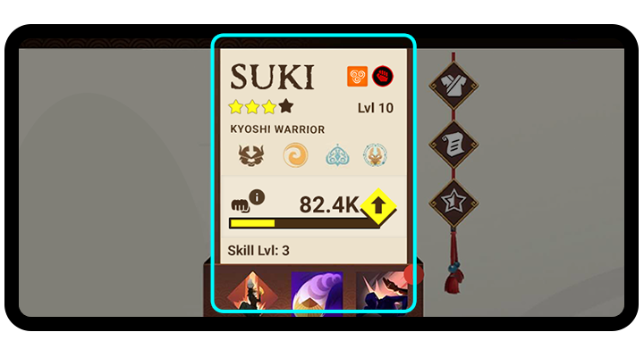
Character Inventory Screen
Re-grouping the categories and simplifying the layout will help players feel less overwhelmed when they encounter multiple icons and buttons. Additionally, maintain consistent UI elements to achieve balance with the icons.
Before
After
Display
User engagement
To boost user engagement, we conducted a survey using SurveyMonkey. Based on the data collected, we made enhancements to the game to improve the player experience.
Impact
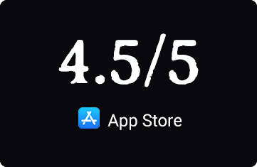
Our team effectively communicated our requirements and successfully launched the game, which has received high ratings on both Google Play Store and the App Store.
Next Challenge
Continuously monitor user behavior and engagement through analytics and online comments to enhance the user experience of our game.